Gather
Designing a full mobile event discovery app for a startup, from onboarding to heatmap.
- Role
- Product Designer
- Timeline
- 2 months (ongoing)
- Type
- Freelance client work
- Tools
- Figma
The Story
Existing event apps prioritize private events and personal networks, leaving public social discovery largely untapped.
Event planning apps have a visibility problem. The most popular ones are built around private or ticketed events, which work best if you already know what you’re looking for. But what about the spontaneous energy of a city? The open parties, the pop-up gatherings, the events you didn’t know you wanted to go to until you saw them?
Gather is a startup building an event platform designed to solve exactly that. When the founder reached out to me, they had a clear product vision, a backend team, a frontend team, and no designer. I was brought on to design the entire mobile experience from scratch: 36 screens covering every flow from first download to event creation, RSVP, social connections, and discovery.
The Brief
The founder came in with a sharp point of view: existing event apps prioritize private events and personal networks, leaving public social discovery largely untapped. Gather wanted to occupy a specific middle ground, meaning it had to be structured enough to feel like a real event platform, yet open enough to feel like a window into what’s happening in your city.
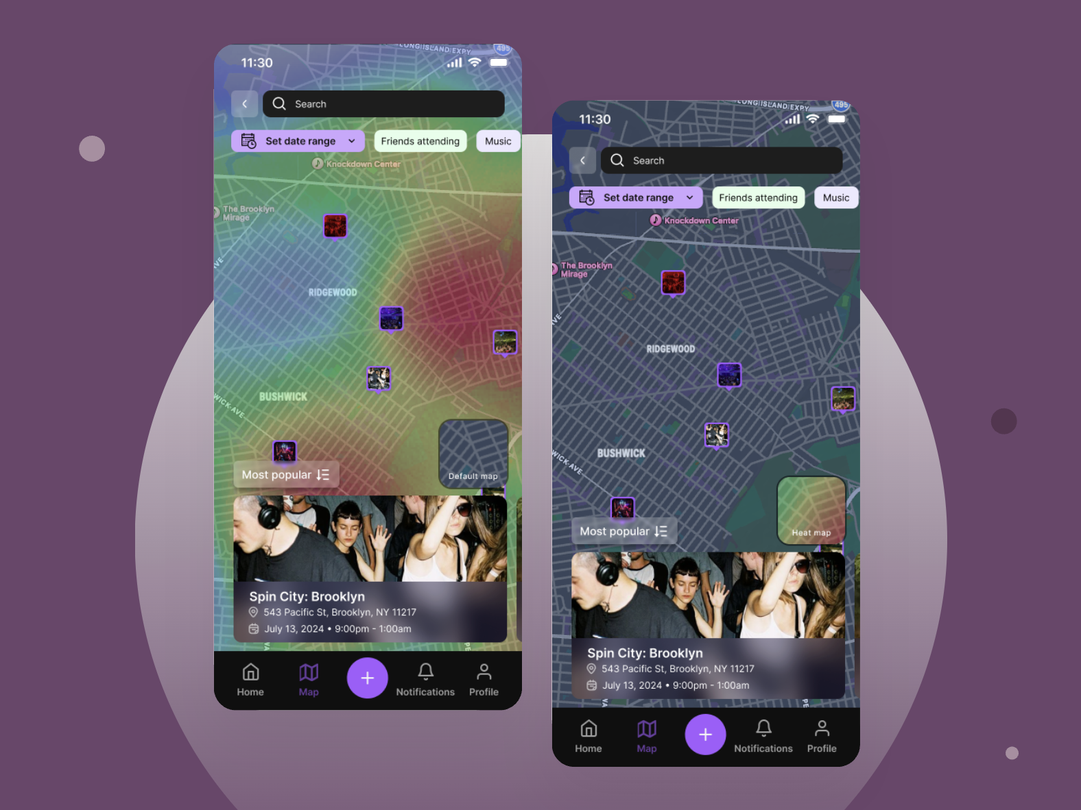
The product’s core proposition was a map-based discovery layer: a live view of public events nearby, filterable by date, event type, and friend RSVPs, with an optional heatmap showing where activity is concentrated. Think Snap Map, but for events rather than people.
My job was to translate that vision into a coherent, polished mobile experience that felt at home alongside apps users already knew, while carving out its own identity.
A live map of public events nearby, filterable by date, type, and friend RSVPs, with a heatmap showing where the energy is.
My Approach
Because the team was small and working fast, my process was collaborative but autonomous. The team had documented detailed user stories organized by version (V0 through V3), which gave me a clear prioritization framework from day one. I worked through V0 and V1 stories, designing screens and flows as needed, and we’d sync regularly over comments in Figma and direct messages to discuss edge cases and iterate.
One thing that shaped my process significantly: my background as a software engineer. All while I was designing screens, I was also thinking about how they’d be built. I gravitated toward patterns I knew were clean to implement, like reusable event cards, consistent component states, and clear separation between views. This meant fewer back-and-forth cycles with the frontend team on feasibility and more time spent on the design itself. I never had to be told “we can’t build that” because I was already designing with implementation in mind.
- 36 screens
- designed end to end
- 2 months
- initial engagement
- V0 + V1
- user stories executed
Visual Direction
The aesthetic direction came out of early conversations with the team. We looked at the existing landscape and asked what felt missing. The answer was atmosphere. Event photography is inherently dramatic and visceral, and we wanted a design that let it breathe rather than fighting it with a loud UI.
We landed on black and deep purple as the primary palette. Dark backgrounds make event photography pop. Purple carries enough personality to feel distinctive without being garish. The rounded pill buttons and soft gradients add warmth to what could otherwise feel cold. The result is an app that feels like it belongs in the same world as the events it’s promoting: nightlife-adjacent, energetic, but not chaotic.
Palette
#0A0A0A
Primary
#7C3AED
Accent
#FFFFFF
Surface
Typography
32px — Semi Bold
Your Guide to What's Happening
18px — Medium
Spin City: Brooklyn
16px — Regular
543 Pacific St, Brooklyn, NY
12px — Regular
July 13, 2024 • 9:00pm - 1:00am
Design Decisions
Onboarding
One of the first flows I designed was onboarding, and one of the most important decisions happened before a single screen was drawn. Most apps force a fork at the door: "Log in" or "Create account." This is friction that serves the app, not the user.
We took inspiration from how Partiful handles authentication: a single phone number field, a one-time SMS code, and the app handles everything else in the background. New user? Account gets created. Returning user? You're logged in. The user never has to make a decision they don't care about.
The result is a three-screen onboarding flow: a full-bleed splash screen with Gather's tagline ("Your Guide to What's Happening"), a phone number entry screen, and a verification code screen. That's it. From cold open to inside the app in under a minute.
The Event Page
The event page is the heart of the app. I thought about it less as a data display and more as a conversation: what does someone need to know, and in what order?
The answer I landed on: hero image first (set the vibe), then the essentials (name, location, date and time) followed by a countdown to create urgency, then the social proof of who else is going, then the full description for the committed reader, then a map for the logistical planner, then host information for the trust-builders. The persistent RSVP button at the bottom means the call to action is always available without interrupting the reading flow.
The RSVP interaction itself ("I'm there!", "No way!", "Maybe...") was an opportunity to inject personality. The patterned button backgrounds (polka dots, checkerboard, stripes) feel deliberately playful and on-brand for a nightlife context. The options are binary enough to be decisive but human enough to not feel clinical.
The Map
The map was the most technically ambitious feature and the one that required the most design thought. A map full of events could easily feel overwhelming, or worse, surveillance-y. I made two key decisions to prevent that.
First, the heatmap is opt-in and toggleable. Users who want to see where the energy is concentrated can turn it on; users who just want to browse individual events can leave it off. This respects different use cases without forcing everyone into the same mode.
Second, the map has a persistent bottom drawer that surfaces the most relevant event as you pan around. You don't have to tap individual pins to find out what's nearby — the drawer does that work for you, updating as you move. This keeps the interaction feel light rather than finicky.
The Profile
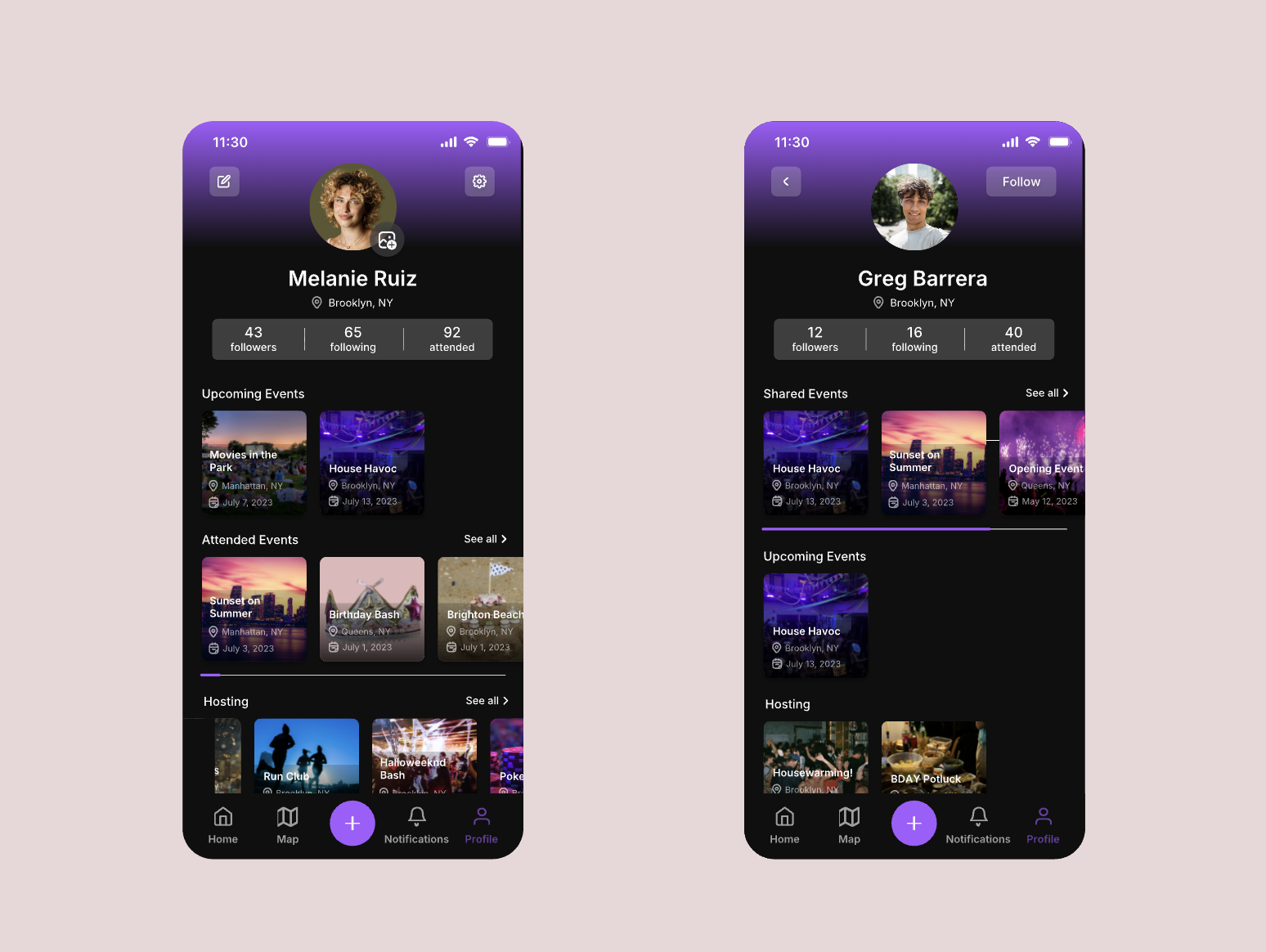
Social app profiles are usually built around self-presentation that is carefully curated, follower-count-forward, and designed to be seen. I made a deliberate choice to design Gather's profile differently: as a personal dashboard first.
Your profile shows your upcoming events (because people constantly recheck event details), your attended history (because people love their own data), and what you're hosting. The social stats are there (followers, following, attended count) but they're not the hero. When you view someone else's profile, the first section you see is Shared Events: events you've both attended or both plan to attend. This reframes the profile as a tool for understanding your relationship with someone, not just broadcasting your activity.
This decision was a direct response to the product's core philosophy: Gather is not a social media app. It borrows social mechanics to make event discovery better, but the event is always the point, not the person.
Event Creation
Creating an event is a high-friction flow in most apps. I worked to make it feel as fast and direct as possible. The create/edit view mirrors the attendee event view closely, with the same layout and same information hierarchy, so hosts are always designing for what attendees will see. Fields like "Unlimited spots," "Guests can bring +1s," "Cost per spot," and "Event privacy" are presented as toggleable buttons rather than dropdown menus or nested settings screens, which keeps the visual weight low and the interaction fast.
Scope & Prioritization
Working from the founder’s V0/V1/V2 framework, I made active decisions about what to design first and what to defer. V0 covered the essential flows like onboarding, event discovery, the map, event pages, RSVP, basic profiles. V1 added filtering, event updates, and social features like followers and find people. V2 features including the heatmap’s friend-visibility toggle and a planned AI event planning assistant, a conversational interface that would help hosts plan and describe events, are scoped for future design work.
Every deferred feature was a deliberate choice to protect the product’s focus. The most important example: no social feed. A feed was discussed and declined. Without it, the app stays focused on its primary job of helping people find and attend events rather than becoming a platform that incentivizes hosting events for social performance rather than genuine gathering.
V0
Core flows — onboarding, map, event pages, RSVP, basic profiles
V1
Filtering, event updates, followers, find people
V2+
PlannedHeatmap friend visibility, AI planning assistant (planned)
Outcome
The app is currently in development and approaching release. The founder and frontend team have continued to reach out for design support even beyond the initial engagement, which signals to me that our working relationship and the designs have held up well as the product has moved closer to shipping.
Reflection
Gather was my first professional design engagement and the project that showed me how well my engineering background translates into design practice. I believe my understanding of component reusability, implementation complexity, and system thinking made my designs better.
With more time I'd want to conduct user research beyond the founder's user stories, especially around the map interaction which is novel enough to benefit from real usability testing. I'd also want to design out the AI planning assistant flow, which I think has the potential to be one of the most distinctive features in the product.
Accessibility is something I'd approach more intentionally on future projects. Elements like contrast ratios on dark backgrounds require extra care, and designing for one-handed use is especially relevant for an app people will use while out at events.
More coming soon
The next case study is currently in progress. Check back soon.