Layover

Designing and building a personal travel atlas from product idea to deployed product.

Role
Product Designer & Engineer
Type
Independent product
Platform
Responsive web app
Status
Deployed product

The Story

Flight apps are great at telling you where your plane is. I wanted one that showed me everywhere I had been.

Most flight tools focus on the trip happening right now: gates, boarding, delays, departure times. Layover explores the opposite idea: what could a flight product look like if its value grew after the flight was over?

I wanted flight history to feel accumulated over time, not trapped in a spreadsheet of past reservations.

Product Thesis

Travel history should feel emotional enough to explore and structured enough to inspect.

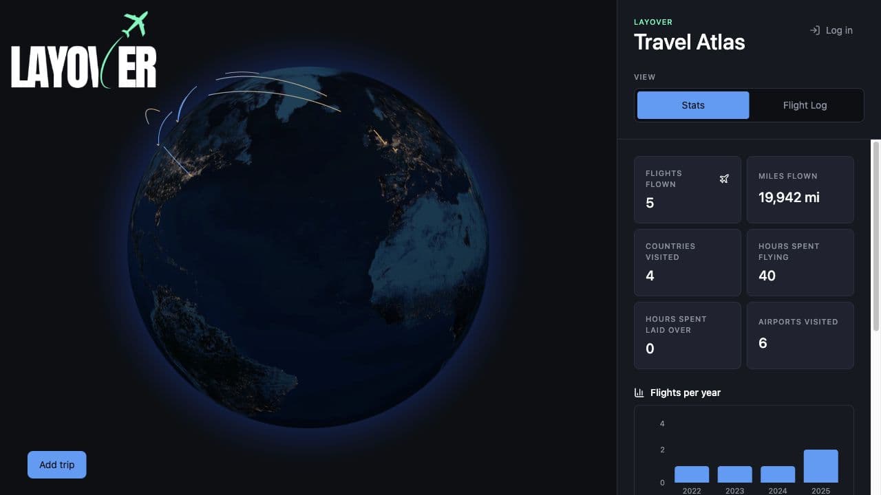
Layover dashboard showing a 3D globe with flight arcs and an inspectable statistics sidebar

Emotional layer

The globe makes the archive feel worth exploring.

Inspectable layer

The sidebar turns the same data into statistics, yearly patterns, routes, and chronological flight history.

My Approach

I did not treat design and implementation as sequential phases. Figma helped me reason through information architecture, hierarchy, flows, visual direction, and the design-system structure.

The coded product helped me evaluate motion, density, responsiveness, interaction behavior, real data, and technical constraints. Sometimes I changed the design first. Sometimes I changed the React implementation to understand the product problem, then folded that learning back into the design.

01

Design

02

Build

03

Use

04

Notice

05

Refine

Building The System

The Figma system and the codebase had to describe the same interface.

Layover has a full Figma design system, but the important part was translating that system into implementation primitives instead of letting it remain a static design artifact.

Variables, tokens, primitive controls, and composed interface patterns map into CSS custom properties, Tailwind usage, and reusable React components.

Figma

Variables
Primitives
Composed components

Code

CSS custom properties
Tailwind utilities
React components

Key Product / Technical Decisions

Keep the globe in context

The globe is the defining product object, so I kept it present while deeper workflows open through the sidebar and modal layer. Adding flights, reviewing a log, and exploring route detail all happen without making the user leave the map behind.

That created a real tradeoff: the sidebar had to carry more complexity. I made that tradeoff intentionally because the reward loop depends on immediate context. The user should understand that every record changes both a list and a living atlas.

Add a flight, see your map change.

Make input simpler than the data

A flight record contains airports, coordinates, route distance, airline data, dates, times, duration, cabin class, aircraft, and trip-leg relationships. The form does not ask users to think in that schema.

Fuzzy airport search, IATA code lookup, flight autofill, duration calculation, and overnight arrival indicators absorb the structured-data work so the interaction can stay short and legible.

The system can be complicated without making the interaction feel complicated.

You enter

UA 58

SFO

Aug 18, 2026

Layover resolves

SFO -> FRA

United UA 58

1:55 PM -> 9:45 AM +1

10h 50m

Design imports for imperfect data

Bulk import is where workflow design gets less glamorous and more important. A CSV or calendar file can be partially right, partially wrong, and still valuable.

The import flow moves from upload to review to confirmation. Rows are validated before saving, errors live next to the affected row, and valid records can be reviewed instead of making the entire import feel like one fragile all-or-nothing action.

Errors should be specific, recoverable, and proportional to the problem.

01Upload
02Review + errors
03Confirm

Let implementation expose product problems

The populated interface made sense in mockups, but the built product with zero flights revealed a weaker first-run experience. The screen did not yet make the reward obvious.

I revised onboarding around a direct promise: add your first flight to draw your first route. That change came from using the working product, not from polishing a static screen in isolation.

Design -> build -> use -> notice -> refine.

Layover empty dashboard onboarding prompt with the globe visible behind it

Let architecture evolve with the product

The MVP started local-first with IndexedDB and Dexie, which kept scope contained and made the core atlas shippable sooner. That was not a mistake; it was the right architecture for proving the product loop.

As the product grew, persistent personal travel data made cross-device sync worth the added complexity. Layover expanded to Supabase auth and cloud persistence while retaining local behavior where it still improved the experience.

Pick the simplest architecture that supports the current product, then change it when the product creates a reason to.

01 - Start local

Ship the core idea

UIBrowser
DBIndexedDB + Dexie

Why

Validate the atlas without accounts or backend infrastructure.

02 - Add persistence

Support personal history

IDAccount
APISupabase authentication + flights table
sync
APPLayover app
cache
DBLocal Dexie cache

Why

Persistent travel history became more valuable than browser-only storage.

Connected Data Views

One flight object becomes multiple ways to understand a travel history.

The globe, stats, flight log, and route detail are not separate features. They are connected representations of the same underlying data.

Users should be able to move between geographic, chronological, statistical, and route-based views without reconstructing the relationship themselves.

One flight, multiple views

JFK -> SEA

One underlying flight record, several ways to understand it.

Jun 22, 2025

Where did I go?

The route becomes a geographic arc.

Isolated Layover globe with animated route arcs representing flight geography.

When did I go?

The same record sits in the chronological log.

2025

JFK -> SEA

Jun 22, 2025 · 2,415 mi

Economy

SEA -> JFK

Jun 14, 2025 · 2,415 mi

What did it add up to?

Totals and charts are computed from flight records.

Flights flown

5

Miles flown

19,942 mi

Flights per year

2023-2025
1
2023
1
2024
3
2025

Where do I keep returning?

Repeated routes become their own summary.

Top routes

JFK ↔ SEA

4,830 mi

2

SEA ↔ LHR

4,786 mi

1

Under The Hood

Technical choices are presented where they explain product behavior.

React + TypeScript

Component architecture and typed flight data.

Globe.gl

Interactive 3D route visualization.

Fuse.js

Fuzzy airport search across global IATA data.

Papa Parse

CSV parsing for reviewable import flows.

Recharts

Yearly and aggregate travel statistics.

Dexie + Supabase

Local-first behavior with cloud persistence when signed in.

AI-Assisted Development

I used Codex and Claude Code heavily to accelerate implementation, but I retained responsibility for product decisions, UX, architecture, task decomposition, implementation direction, reviewing generated code, debugging, testing, and deciding what shipped.

The AI tools made execution faster. They did not replace the product judgment required to decide how Layover should work or whether the final experience was good enough.

What I Owned

Product

  • Concept
  • Product thesis
  • Information architecture
  • Feature prioritization
  • Edge cases

Design

  • Visual direction
  • Design system
  • Figma components
  • Interaction design
  • Iteration

Engineering

  • Frontend architecture
  • React/TypeScript implementation
  • Data modeling
  • Persistence
  • Deployment

Outcome

Layover is a working product, not just a prototype. It ships the core loop of adding flights, seeing routes appear on a 3D globe, inspecting aggregate travel stats, reviewing chronological history, importing flight data, and persisting personal travel records locally or through account sync.

The strongest outcome is coherence: the product thesis, visual system, interaction model, data model, and frontend implementation all point at the same idea.

Reflection

The hardest parts of Layover were not the surface-level UI choices. They were questions about what information stays visible, how workflows preserve context, how much data complexity to expose, how to recover from imperfect input, and when an architectural shortcut stops serving the product.

Design and engineering are not two sequential steps in making a product. They are two ways of reasoning about the same problem. Layover got better because I could move between both.